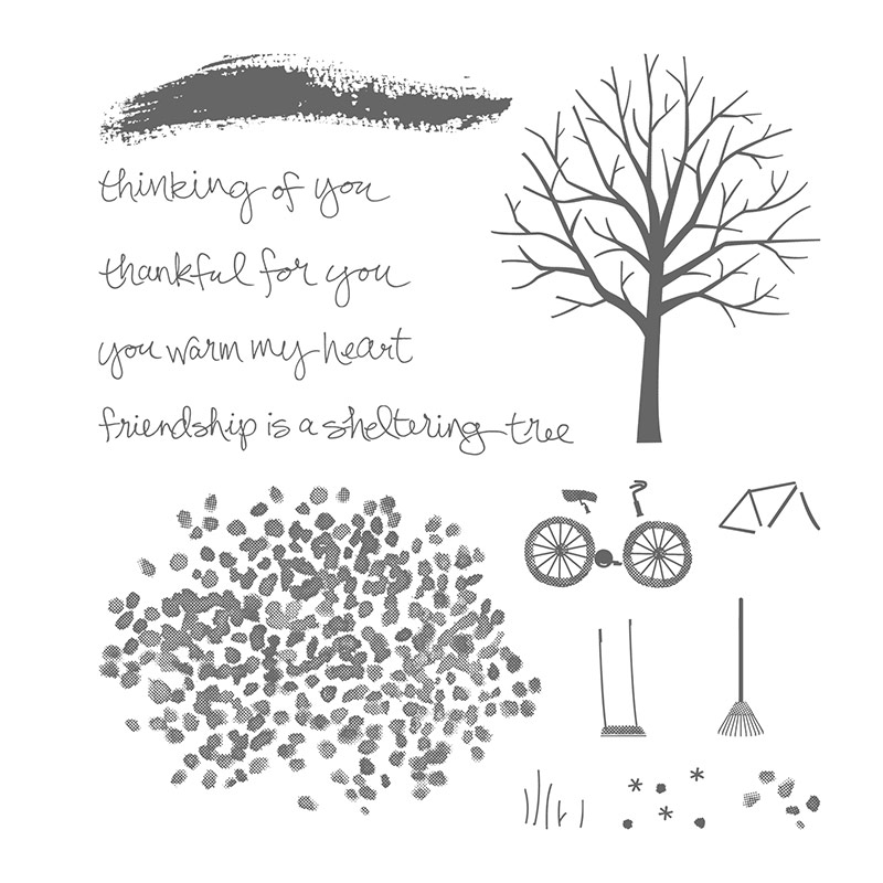
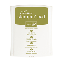
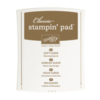
For today's card I used the very versatile SHELTERING TREE stamp set:
This card is a classic example of how I can't just walk away from the card !!! Do you think that I have overdone it?!......probably! Oh well back to the drawing board.
I would like to enter:
Less Is More 'one layer' autumn
Allsorts challenge 'no design papers'
Papertake Weekly 'anything goes'

Stampin᾿ Up! Supplies




I love this stamp set, great job.
ReplyDeleteThank you for joining us at Allsorts this week :)
AnyOldCraft (DT)
Hello Eve: Your card is so beautiful, I love how you made the leaves look like they are being blown by the sweet Autumn winds. Fabulous colors, just lovely.
ReplyDeleteThank you for sharing at "Less is More".
Hugs,
Maria Rodriguez.
Fabulous autumn card! I love the stamp set you've used, looks amazing in the autumn colours. xx
ReplyDeleteWonderful tree design and colors Eve.
ReplyDeleteHugs Diane
Stunning, classy and perfect for our one layer autumn challenge Eve
ReplyDeletethanks so much for sharing and taking part.
Sarah xx
Less is More
Gorgeous image and love the colours and layout. Hope you are managing to control the Playground that Sarn can cause a riot anywhere.
ReplyDeleteThanks for joining in our No designer papers this week at Allsorts
Kath
Absolutely beautiful Eve! Certainly not overdone at all - love how the leaves sweep down to the sentiment, very stylish indeed! Clever girlie!
ReplyDeleteHugs
Di xx
Beautiful - I adore this set and your card is just perfect x
ReplyDeleteLove the create way in which you used that stamp set...I have a tree die...maybe I can make something similar
ReplyDeleteCheers
Dr Sonia
What a beautiful scene! The stamp set is gorgeous!
ReplyDeleteGorgeous card, Eve. I've not yet got this stamp set, but it's getting ever higher on my wishlist. Thanks for stopping by my blog and I hope to see you again soon.
ReplyDeleteHugs,
Em
Eve what a beautiful autumnal creation, love the leaves falling.
ReplyDeleteThank you so much for joining us.
Anne
"Less is More"
I love your use of these stamps, this is a super little scene!
ReplyDeleteThanks so much
Chrissie
"Less is More"
Love this scene, fab colours and so much movement to portray the wind.
ReplyDeleteThanks for sharing with us.
Anita x
Less is More